The North Face |
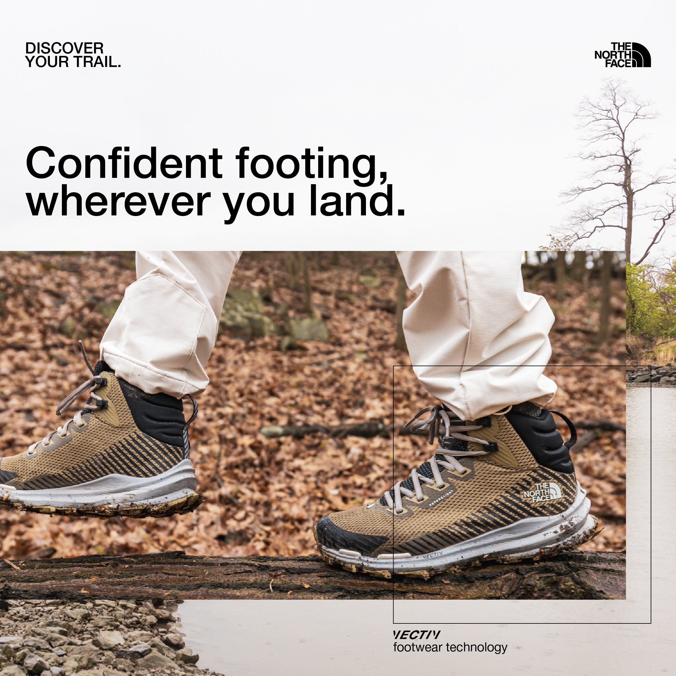
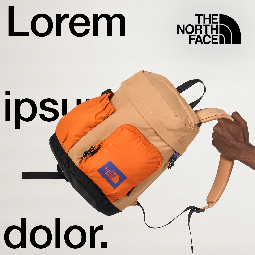
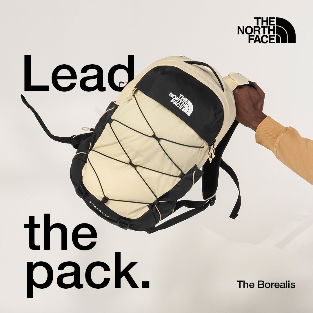
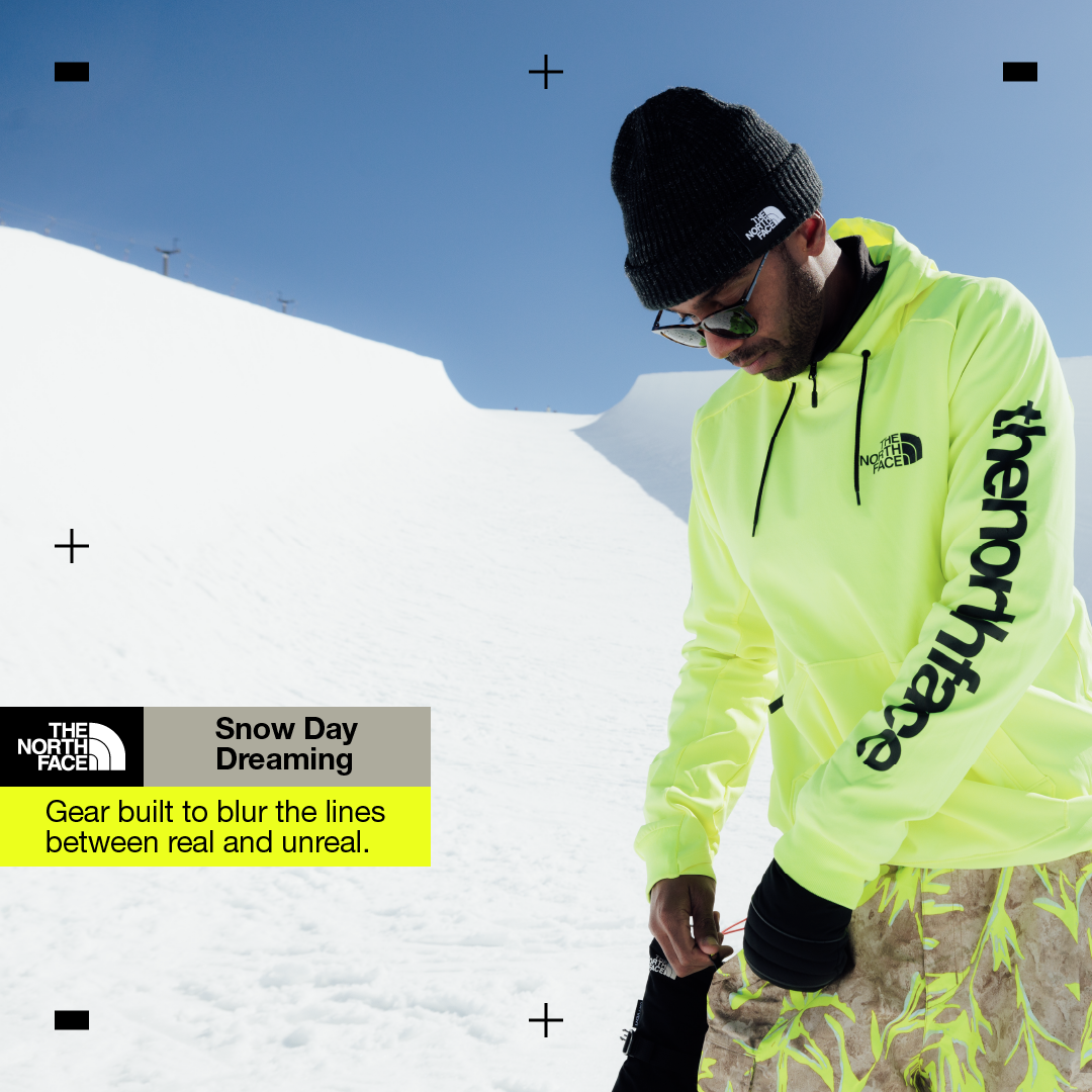
Collaboration with ↳ The North Face grew and evolved over time. We created a vast body of work to speak to the brand’s story and values. The brand’s guidelines were our North Star, however there was a continuous conversation on where tweaking would make sense or support the specific campaign. We have worked on many campaigns simultaneously, which was a challenge in terms of the time creative had, but was also an amazing opportunity to treat our assets as parts of a system, and test different variation against one another. High performing assets provided valuable data that creative then implemented in following campaigns. Shown here is a small sample created for social.
Agency WITHIN, 2022-2023
Creative Director: Ian St. George Freeman, Stephen Bechtoldt


rag & bone |
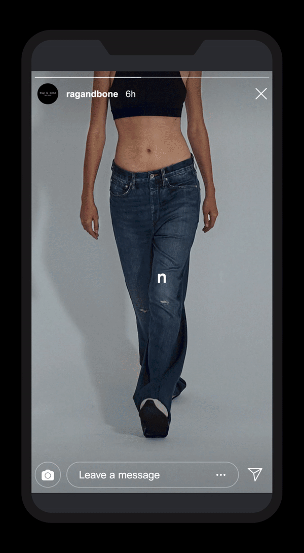
↳ Rag & Bone prides itself on a strong DNA. It is all about its commitment to quality, originality, authenticity and elegance. Yet, this story isn’t fully conveyed in current creative. Creative assets rely on brand equity and promos, making it harder to reach new potential brand lovers, or deepen relationships with the existing circle. The challenge here was repurposing existing assets to both build a love for the brand and drive high performance. The proposed solution was an experiment with different footage and editing styles while keeping the feel of a cohesive campaign consistent.
Agency WITHIN, 2021
Creative Director: Ian St. George Freeman
Art Director: Sara Zaher


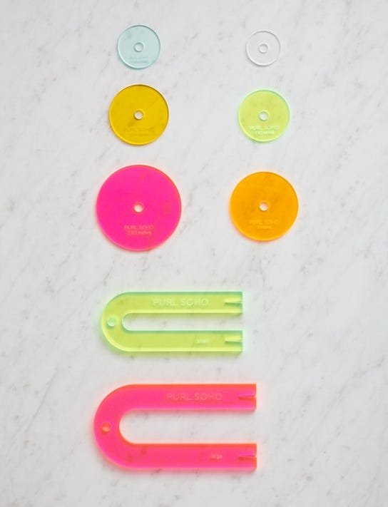
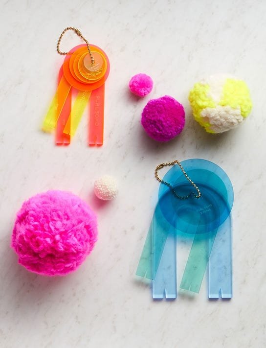
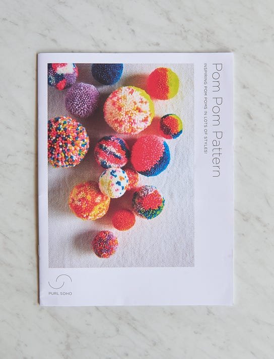
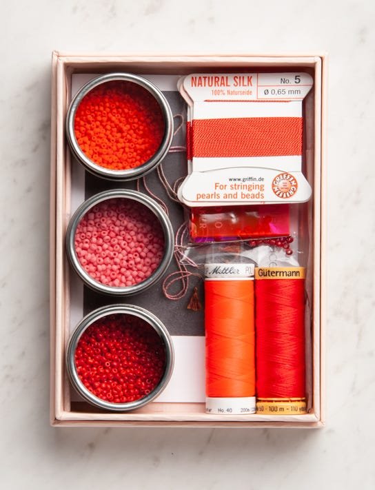
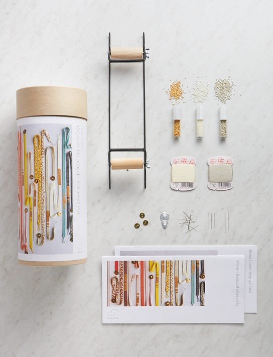
Purl Soho |
↳ Purl Soho is the ultimate hub for makers and artists. It is an environment saturated with vast knowledge of traditional craftsmanship and folklore. We worked together to create two of their best selling kits, and touched upon product design in the process.


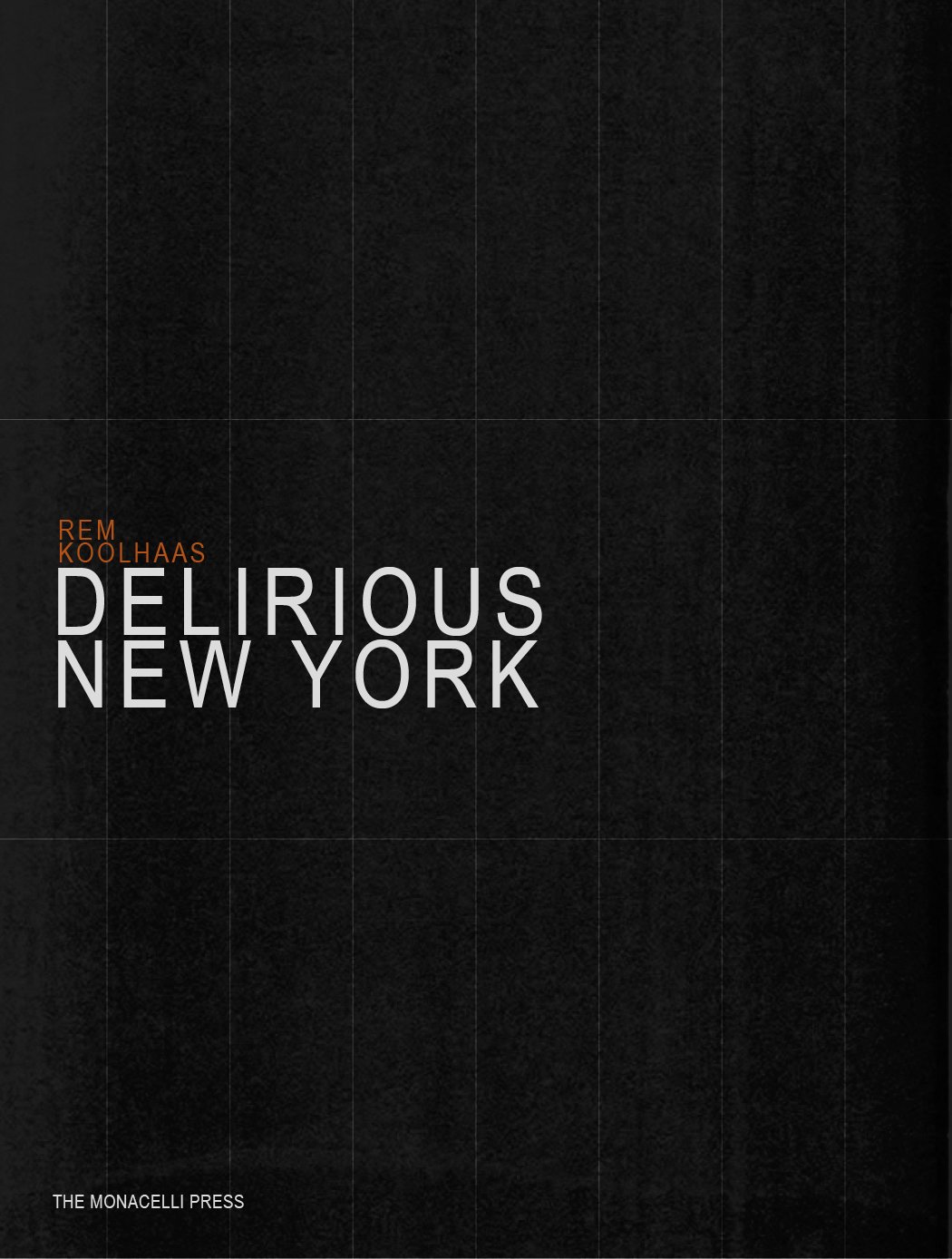
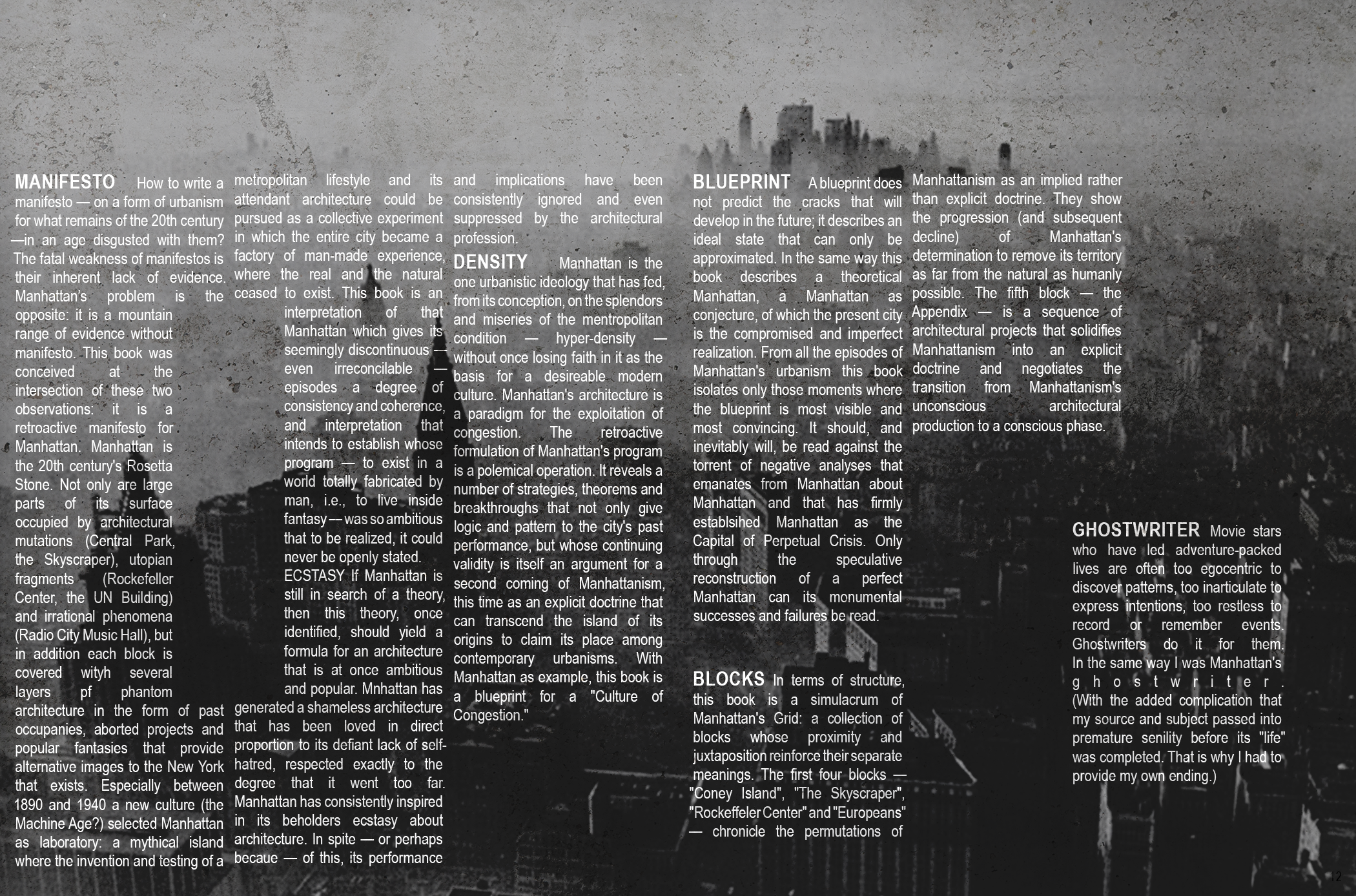
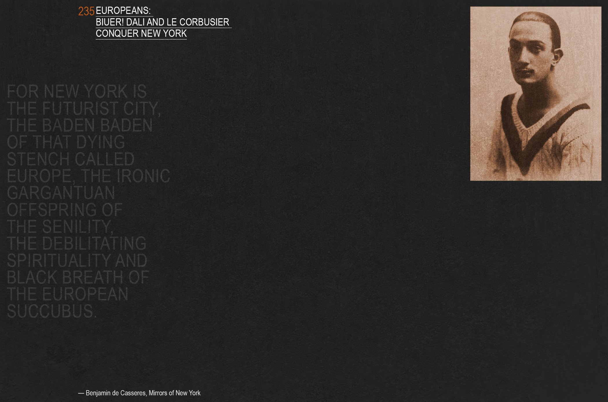
Delirious New York |
Spring 2010, Technion School of Architecture in Haifa, Israel. I was on a mission to read Delirious New York thoroughly, so I could give a proper talk about it to my classmates. I missed one full week of classes and many hours of sleep along with my faith that life outside this printed devil-in-disguise existed. I was determined to show up prepared with the best talk anyone had ever heard. Having to refer to a dictionary every four words or so on average didnʼt help.
Rem Koolhaasʼs imagination was wild, deep, esoteric. His work, built or imagined, was, as well. I was going to crack this enigma wide open.
“Manhattan.. Manhattan.. Manhattan”.. The mantra was way more powerful than any of the many, MANY analogies in the book. “Manifesto,” “Utopian fragments,” “Simulacrum.” Everything in there was complicated AF. I mumbled my way through that miserable talk. My audience was SO not into it.
Brooklyn, Winter 2018. This is a retroactive design to a retroactive manifesto for New York City, served with a much happier heart, way less anxiety, and a more solid command of the English language.


Max Cooper |
Inspired by this contemporary composer and named after him, I created an alternative typeface with an edgy take on the serif. I applied the typeface to a number of posters which were ultimately used as promotional material for a performance in NYC.
Max is a Ph.D. in computational biology. His research interests focused on modelling the evolution of gene regulatory networks. He specifically examined the evolution of feed-forward loops and networks, concepts he is able to transcribe into music and weave into his compositions.


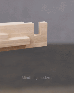
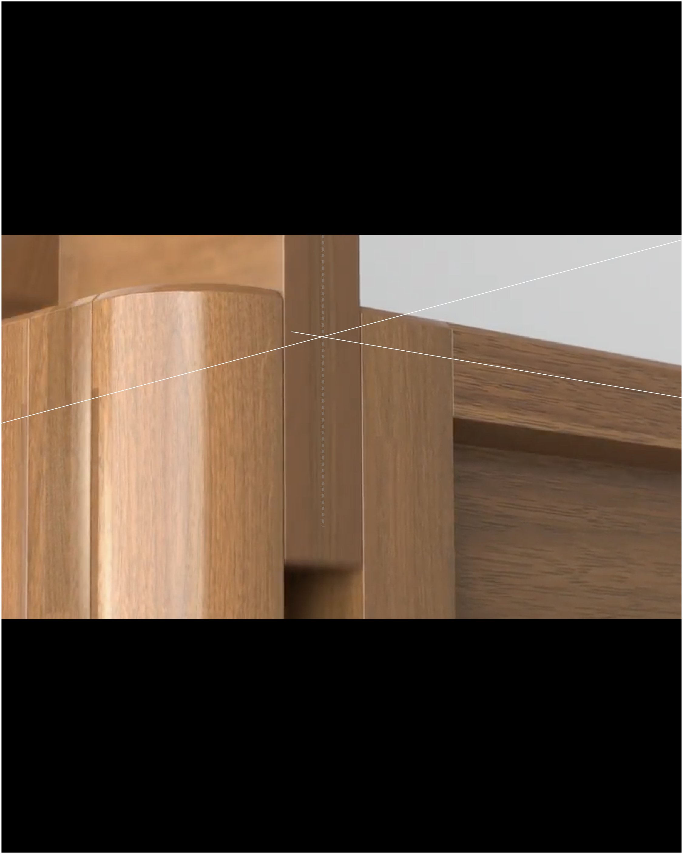
Thuma |
↳ Thuma is an affordable but luxurious lifestyle brand. With its core mission being bringing quality into a saturated industry, Thuma introduces a line of simply constructed bed frames and bedroom accessories.
The following videos were created for Instagram and Pinterest. They ran simultaneously for performance testing.
Agency WITHIN, 2021
Creative Director: Ian St. George Freeman
Art Director: Joshua Lebowitz
Team members: Van Jayson Pelayo, Brennan Brinkley


Nike |
What can be said about Nike that hasn’t already been said, retweeted or recycled? ↳ This article seems to have nailed it. It was published while work on a meaningful RFP was underway. Research clues from Marketing and Strategy were flying in at high speed. Heads were turning right, heads were turning left. Heads were spinning. We were all trying to crack the magic, and pin this thing down. The cultural hype is so deep 50 years into the brand’s existence, this huge mission is almost impossible. One great lesson learned, though, was that too many cooks in the kitchen would lead one designer down dark, twisting rabbit holes. The exit looked like a Google Slide deck in black and white, with some minor splashes of color and very cool photography provided by the brand.
Agency WITHIN, 2021